By Brad Thor
Art Director: Alan Dingman // Atria Books / Simon & Schuster
#1 New York Times bestselling author Brad Thor brings readers his darkest and most intriguing thriller yet — a terrifying story of espionage and betrayal — brilliantly paced with superb nonstop action.
Born in the shadows and kept from heads of state, there are some missions so deadly, so sensitive, that they simply don’t exist. When one such mission goes horribly wrong, a wave of dramatic terrorist attacks is set in motion. Their goal: the complete and total collapse of the United States.
With the CIA’s intelligence abilities hobbled, former Navy SEAL Team 6 member turned covert counterterrorism operative Scot Harvath launches an audacious plan to infiltrate the terrorists’ network and prevent one of the biggest threats the United States has ever faced.
Simultaneously, a foreign wet work team has been sent to California. Their target: one of Hollywood’s most famous filmmakers. While working on a secret documentary project, movie producer Larry Salomon has unknowingly exposed one of the world’s wealthiest and most politically connected powerbrokers — a man with a radical anti-American agenda poised to plunge the nation into deadly, irreversible chaos.
As the plots rocket to their pulse-pounding conclusion and the identities of the perpetrators are laid stunningly bare, Harvath will be left with only one means to save America. Unable to trust anyone, he will be forced to go Full Black.
Intense and frighteningly realistic, FULL BLACK is, hands down, Brad Thor’s most riveting thriller to date.

Alan Dingman is a fantastic portrait painter / illustrator and an Art Director/Designer at Simon & Schuster Pocket Books. We both worked together at St. Martin’s Press oh so many years ago and I recently hired him to illustrate FAME: What the Classics Tell Us About Our Cult of Celebrity for me. He called me asking if I could recommend anyone new who could design BIG BOOK COMMERCIAL THRILLERS. I immediately recommended my super talented colleague Ervin Serrano, who is the Associate Art Director at St. Martin's Press. But for some reason, probably my competitive nature, I asked if I could take a stab at it. Now I don’t do many BIG COMMERCIAL BOOK packaging but I told him that I wanted to do more and to give me a chance. I would try one quick go and if he didn’t like it, he could immediately hire someone else. Turns out that they were looking for a new approach to packaging their bestselling author Brad Thor so they were open to something different. What I thought I could offer this genre was a clean, and simple approach. I saw that the author and title were mostly short four letter words that would stack nicely. I had only one idea that I wanted to pursue, a dynamically angled typographic dominant approach.
My first round I tried the angled type set in Trade Gothic Bold Condensed and placed that over a foreboding Washington DC landscape with an ominous glow coming over the horizon. Hmm, that's not going to work. The type forms looked bad and the image was a bland cliché.

Alan sent me a link to a stock photo house that specialized in military type images and I changed the typeface to UNIVERS. Feedback: they thought the type was too playful but they liked the positive/negative interaction with type within the image:


I didn’t want to give up on the angled type. Maybe it was the typeface and not the angle treatment that they had problems with. Maybe the rounded curves of the UNIVERS “R” looked too friendly and the negative spaces were too open and generous and the widths uneven. I like that the “F” filled out the negative space better and the forms were more even. But it felt kinda bland.
Trade Gothic Condensed:

Univers Condensed:

Akzidenzs Grotesk:


Various Akzidenzs Grotesk Angled type configurations:


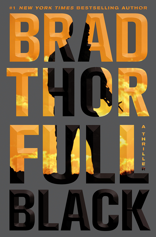
When I switched to AKZIDENZ GROTESK, I saw that this was more of what I was going for. Even sides, sharper corners and even type color overall. I tried comps using different angle configurations but they went with the type set straight forward, which in the end, I did have to agree with. Hey, I had to try the angle.


It was a challenge positioning the image and type to interact so that the figure's action made sense through the type and still have the type be legible. With each version I tried, I wanted to make sure that the word BLACK stayed mainly all black and create some calm space on the cover that wasn't so active. For something so simple, I presented over 60+ image & color combos, which isn't much considering that BIG BOOK projects can generate 100s and 100s of comps and the hiring of several designers. Big Books = Big Expectations.
The final silhouette had to be adjusted slightly to make it less militaristic and more Black Ops. Here's the final approved design before we Chisel Embossed it up:

I was so happy that the Publisher and author liked this approach off the bat which was a nice surprise. Using genre elements of big type, big author and a silhouetted figure against bright colored background but in a simple, clean and direct way. Good for an ongoing series look. And the book is currently on the New York Times Bestsellers List. Even though Brad Thor is no stranger to the Best Seller list, I like to think that my design had a small part in setting him up to new readers.
Brad AD sighting on the LIRR:

(photograph by Patrice Kaplan)
Author Brad Thor on Piers Morgan Tonight / CNN with my jacket in the background:

CNN Video: Author Brad Thor on the Norway terror attacks:
Designer Paul Bacon is known for introducing the "Big Book Look" in book jacket design. His 1956 jacket design for Compulsion, a novel by Meyer Levin marked the inception of the "Big Book Look". This look features a large, bold title, a prominent author's name, and a small conceptual image:

“The big book look,” by Field Maloney / The New York Times Book Review, February 11, 2007:

The St. Martin's Press "Blues Crew" Art Depts. We were such non-conformist back then.

Left to Right: Evan Gaffney, Junie Lee, Alan Dingman, Judith Stagnitto Abbate, Henry Sene Yee, & Jennifer Chiorazzi


5 comments:
Oooh! I can dig it. Love many of the outtakes too. Any embossing or special treatments? Didn't see anything mentioned.
Thanks Ian. Background is matte, type is glossy to pop the blacks with CHISELED EMBOSS YO!
The new king of the big book look. Love the jeans shirt pic. My father is still wearing his jean shirt from the same era, it's pretty threadbare.
Wow, a total departure for you! Love the whole process here. Looks like a million bucks.
The Brad Thor "Full Black" jacket is probably the best I've ever seen. I even gave it a mention on my Amazon review of the book. Nice work.
Post a Comment