Thursday, January 28, 2010

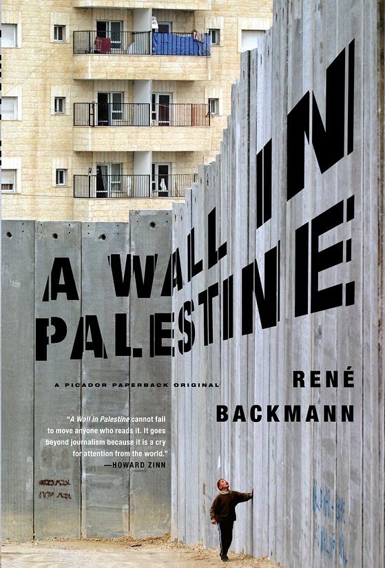
A Wall in Palestine


by René Backmann / A Picador Paperback Original

Cover photograph by © REINHARD KRAUSE / Reuters / Corbis

• A 2011 PRINT Magazine Regional Design Annual Winner
• An AIGA's 50 Books // 50 Covers Best Cover 2010 Winner
• Praise from Daniel Wagstaff @ The Casual Optimist Blog

The West Bank Barrier is expected to be completed in 2010. Declared illegal by the United Nations International Court of Justice, this network of concrete walls, trenches, and barbed-wire fences could permanently redraw one of the most disputed property lines in the Middle East—the Green Line that separates Israel and the West Bank. To Israel the “security fence” is intended to keep Palestinian terrorists from entering its territory. But to Palestinians the "apartheid wall" that sliced through orchards and houses, and cuts off family members from one another, is a land grab.

In this comprehensive book, Backmann not only addresses the barrier's impact on ordinary citizens, but how it will shape the future of the Middle East. Though it promises security to an Israeli population weary of terrorism, it also is responsible for the widespread destruction of Palestinian homes and farmland; with its Byzantine checkpoint regulations, it has also severely crippled the Palestinian economy; and, most urgent, the barrier often deviates from the Green Line, appropriating thousands of acres of land, effectively redrawing the boundary between the West Bank and Israel.

Backmann interviews Israeli policy makers, politicians, and military personnel, as well as Palestinians living throughout the West Bank, telling the stories not only of the barrier’s architects, but also of those who must reckon with it on a day-to-day basis on the ground.

With bold, brilliant, and often impassioned reportage, A Wall in Palestine renders the West Bank Barrier—its purpose, its efficacy, its consequences—as no book before.


The mechanical had already been typeset and ready to go to the printers when the editor told me that he received a ton of great quotes. Could I fit them all on the back-ad? Sometimes trying to redesign, cram and reflow so much copy into a single centered text column can be a huge last minute annoyance. It wasn't fitting so I thought I could break down the copy into easier to read chunks by splitting them into two columns. But I saw that four flush-left thinner columns would echo the vertical Wall segments on the front cover. I staggered the column heights and added a 1/2 point thick black rule separating the columns to further echo the front cover. I love text copy!


Original type treatment before I was struck by inspiration:

Wednesday, January 20, 2010

The Draining Lake


by Arnaldur Indridason // Picador

Cover photograph by Laura Hanifin

Inspector Erlendur returns in this international Bestseller

Following an earthquake, the water level of an Icelandic lake suddenly falls, revealing a skeleton. Inspector Erlendur's investigation takes him back to the Cold War era, when bright, left-wing students in Iceland were sent to study in the "heavenly state" of Communist East Germany. Teaming with spies and informants, though, their "heavenly state" becomes a nightmare of betrayal and murder. Brilliantly weaving international espionage and a chilling cold case investigation, The Draining Lake is Arnaldur Indriason at his best.


NORDIC DETECTIVES ARE HOT!!!
An article appeared in The Wall Street Journal discussing The growing appeal of Scandinavian crime fiction; existential malaise and bad coffee.

Thursday, December 17, 2009

Wandering Souls


by Wayne Karlin

Art Director: Nicole Caputo // Nation Books / Perseus Books

On March 19, 1969, First Lieutenant Homer R. Steedly, Jr., shot and killed a North Vietnamese soldier, Dam, when they met on a jungle trail. Steedly took a diary—filled with beautiful line drawings—from the body of the dead soldier, which he subsequently sent to his mother for safekeeping. Thirty-five years later, Steedly rediscovers the forgotten dairy and begins to confront his suppressed memories of the war that defined his life, deciding to return to Viet Nam and meet the family of the man he killed to seek their forgiveness. Fellow veteran and award-winning author Wayne Karlin accompanied Steedly on his remarkable journey. In Wandering Souls he recounts Homer’s movement towards a recovery that could only come about through a confrontation with the ghosts of his past—and the need of Dam’s family to bring their child’s “wandering soul” to his own peace. Wandering Souls limns the terrible price of war on soldiers and their loved ones, and reveals that we heal not by forgetting war’s hard lessons, but by remembering its costs.


For freelance clients, I'm just required to design the front and spine and the rest is handled in-house. If I have time, I try to design the entire package. But this time I was swamped. Alyssa Stepien, Nicole's Design Assistant, did a great job taking my design and reinterpreting it for the entire package. Thanks Alyssa.


Alternate sketches:


Monday, December 14, 2009

Think Twice


by Michael J. Mauboussin

Art Director: Stephani Finks // Harvard Business Press

Usually I'm walking on thin ice when my type is illegible. But in this case, illegibility was used to make the reader read / think twice.

Alternate takes:

Friday, December 11, 2009

Bloodbrothers


by Richard Price // Picador

Cover photograph by Bruce Davidson / Magnum Photos

Eighteen-year-old Stony De Coco has to make a choice: either join his father in the tightly knit world of New York's construction unions or take off and find his own path. But Stony’s family is not about to make that choice easy. As he tries to protect his little brother, Albert, from their dangerously unbalanced mother, and to postpone the difficult adult responsibilities that await him, he finds hope in a job working with children at a hospital--a job that promises not to make anyone happy but Stony.

Richard Price's Bloodbrothers is a soulful and often profane story of working-class life in the Bronx, and one young man's bruising initiation into adulthood.


Early Sketches focusing on Co-Op City:


Clockers


by Richard Price // Picador

Cover photograph © Susan Meiselas / Magnum Photos


EDITOR COVER BRIEF:
CLOCKERS by Richard Price

Description:

Rocco Klein is a Dempsy, NJ homicide detective six months from retirement in the opening pages of Clockers. Dempsy, NJ is a lost, desolate place, full of slums hemorrhaging drugs, specifically crack. Strike, the second main character, is the crack dealer. He overseas his host of minions—his clockers—but not without undue stress. His profession makes him nervous and he doubts whether it is truly for him. His boss, the drug kingpin Rodney Little, sees it another way. This sets the stage for the event that catapults Rocco Klein and Strike toward each other. A murder occurs outside a fast food restaurant. Instead of Strike stepping forward, his brother, Victor, admits guilt claiming he did it in self defense. Klein of course does not buy the confession and the pursuit of Strike and Rodney Little begins.

The story is told from the perspectives of both Rocco Klein and Strike, alternating chapters as the novel moves through the grime and grit of slummy NJ. Each character has a distinct view of the world they live in. On the whole, this lets Price create two different worlds within one, a layered city, with each layer utterly connected.

I’d have to say this book is geared toward a predominantly male audience.

The tone is desperate and violent. Every line spoken, every description suggests violence in one way or another. “The New York skyline had begun to bruise purple.”
The language is aggressive and direct. Everything is meant to cut someone else in some way, emotionally, physically. It’s a hard environment and Price paints the picture of Armageddon, the last days over Dempsy, NJ.

Compare this book to all the gritty cop dramas that were once good. NYPD Blue in its beginning days. The Wire (which Price writes for). It’s smart and fast paced. Homicide: A Year in the Killing Streets by David Simon

The language is what makes this book different. Price’s prose clips along. Every character is cunning or done for, and there is a clear line between both. The crack dealers he is portraying are smart, know the game, know the cops, know their clientele. The cops know the clockers, and watch the city and its dismal surroundings, like crooks themselves.

Notable imagery: Strike drinks vanilla Yoo-hoo to nurse and calm his ailing stomach.
Handcuffs. The slums, the endless maze of brick housing projects. The corners, parking lots and concrete yards where clockers know to set up shop. Police interrogation rooms. Crack viles. Beepers or pagers.


Early Sketches:

Thursday, December 10, 2009

The Sixties: BIG IDEAS // small books


by Jenny Diski
BIG IDEAS // small books / A Picador Paperback Original
A brilliant, alternative take on 1960's swinging London, Jenny Diski offers radical reconsiderations of the social, political, and personal meaning of that turbulent era.

What was Jenny Diski doing in the 1960's? A lot: Dropping out, taking drugs, buying clothes, having sex, demonstrating, and spending time in mental hospitals. Now, as Diski herself turns sixty years old, she examines what has been lost in the purple haze of nostalgia and selective memory of that era, what endures, and what has always been the same. From the vantage point of London, she takes stock of the Sexual Revolution, the fashion, the drug culture, and the psychiatric movements and education systems of the day. What she discovers is that the ideas of the sixties often paved the way for their antithesis, and that by confusing liberation and libertarianism, a new kind of radicalism would take over both in the UK and America. Witty, provocative, and gorgeously written, Jenny Diski promises to feed your head with new insights about everything that was, and is, the sixties.

Once you create a series look, you can get handcuffed by it.
For the BIG IDEAS // small books series, photographer Jon Shireman and I had set up a single image conceptual approach, stripped down to its visual essence with a limited color palette around the conceit that the book itself was physically experiencing the BIG IDEA of that book.
This book was not about the 60s as it was experienced in America but in England. So I had to find some way to distinguish this aspect. Without the Civil Rights Movement and the Vietnam War to draw upon, I saw that 60s London was more about external cultural changes. Mod fashion styles, ala Austin Powers. I did some research on Mod culture, Carnaby Street fashions, groovy industrial designs, tie-dye, abstract trippy art and saw that all of those approaches demanded an explosion of colors. Which was a possible problem. This direction might be too colorful to fit in with the established look of the series.


I needed to say UK and the Mod culture of the 60s. I thought of taking the British Flag aka The Union Jack, and tie dyeing it would be a smart combination of the two. Jon had an all-white flag created from cloth and we experimented with just using the flag's blue and red colors. But it wasn't working as well as I thought and there was too much color scattered all around.


Maybe if I tried breaking it into segments to contain the colors. But it still wasn't clicking. BOLLOCKS!

Forget the tie-dye and work in a peace sign instead.

PISS POOR Attempt!

Maybe a more graphic approach. I tried to find relationship patterns between the angles of the peace sign and Union Jack. For a good moment I thought this would be it!

But no. BLOODY AWFUL!

Maybe I should go full out and just commit to using a multi-colored tie-dye pattern to make it recognizable:

BLIMEY! It was too much color and breaking away from the series look. And they all abandoned the simple and original conceit that the books were experiencing the author's idea.

Jon and I brainstormed some more and ended our conversation with absolutely no ideas or direction. We decided to talk again at a later date when minds were fresh. So I hung up and stepped out of my office door and then it hit me. BUTTONS! Growing up in the 80s and hanging out in the East Village of NYC, it was the style to personalize our jackets with objects of our affection/affectation. Our jackets were covered with favorite band logos, bandanas, patches, safety pins, store buttons like CANAL JEANS, FLIP and Trash and Vaudeville and hand-painted back panels and sleeves. I thought that this would allow me to include many of the eclectic ideas of the 60s by representing them in a button and pining it on a clean white Union Jack. e.g. model Jean Shrimpton, peace sign, rock music, drug use, paisley. I saw plenty of 60s political button art but they probably didn't use buttons like this in their 60s fashion. But still, I like that this approach kept the monochromatic color scheme of the series. Maybe the flag could be a white denim jacket. And used colors only as added dashes of accents. I also liked that it was applied onto the flag and removable. Implying that these were fashionable trends of the moment that you can pick and choose and add to yourself and remove when you were over it. I'm not sure if this is the best solution but I was glad I was able to bend the visual closer to the series original intent and tone.