Peter Keller, first college grad from a working-class Yonkers family, thought he was on the road to success. Until no law school wanted him. As he watches his friends advance into promising careers, he jumps from job to job—mail clerk, phone solicitor, stand-up comic—until he breaks down and starts phoning in bomb threats on his own house. He’s going to have to work hard to change the pattern of self-sabotage that has defined most of his life. And taking that job at his alma mater as a teacher of freshman comp and starting an affair with a violently psychotic ex-wife of a colleague probably won’t help matters. Richard Price’s brilliant comic novel is a classic tale of a young man trying to find his place in the world.
Kenny Becker just dumped his girlfriend—the reasons are a little complex. Young and newly unemployed, his main assets at the moment are six-pack abs and a healthy libido—he’s ready to get out, find a little action, and maybe find himself too. But New York is no place for the lonely, and with one meaningless sexual encounter after another, Kenny begins to wonder if the singles scene is not itself a complete con job, with his heart and his future at stake. Raunchy, funny, and surprisingly heartfelt, this 1978 clubland slice-of-life displays Richard Price in gritty good form.
“The couples in this book hail from across America and the world. Most don’t live in New York City. Some never did. What mattered to me was that they met there, in one of its iconic public places. Each of the nine stories begins just before that chance meeting—when they are strangers, oblivious to how, in moments, their lives will irrevocably change.” —from the Introduction
The handsome Texas sailor who offers dinner to a runaway in Central Park. The Midwestern college girl who stops a cop in Times Square for restaurant advice. The Brooklyn man on a midnight subway who helps a weary tourist find her way to Chinatown. The Columbia University graduate student who encounters an unexpected object of beauty at the Metropolitan Museum of Art. A public place in the world’s greatest city. A chance meeting of strangers. A marriage. Heart of the City tells the remarkable true stories of nine ordinary couples—from the 1940s to the present—whose matchmaker was the City of New York. Intrigued by the romance of his own parents, who met in Washington Square Park, award-winning author Ariel Sabar set off on a far-ranging search for other couples who married after first meeting in one of New York City’s iconic public spaces. Sabar conjures their big-city love stories in novel-like detail, drawing us into the hearts of strangers just as their lives are about to change forever. In setting the stage for these surprising, funny, and moving tales, Sabar, winner of the National Book Critics Circle Award, takes us on a fascinating tour of the psychological research into the importance of place in how—and whether—people meet and fall in love. Heart of the City is a paean to the physical city as matchmaker, a tribute to the power of chance, and an eloquent reminder of why we must care about the design of urban spaces.
Art director Alex Camlin, (check out this Q+A he did at The Casual Optimist), assigned me this fun project that combined two things that I love and explore in my personal photography: Serendipitous juxtapositions of people and/or things in the most unexpected places and my favorite place in the world, New York City.
I presented several concept sketches of different approaches but they had a tough time pinpointing a direction for the book. This usually happens when you want the cover to say everything and explain the book. Once you start putting very specific plot elements on the cover, and they're visualized in a literal way, then you are forced to make every detail of each cover element correct. Is this the right time of day in the book? Is that her hair color? Would he write with that pen? I try to avoid that by working with images that are more open to interpretation and hopefully focus more on the emotional aspects of the book. Alex worked with his editors to focus on what was essential. We tried a few more rounds but I was feeling that I wasn't getting want they needed.
Concept sketches:
This comp was inspired by the beautiful opening scene to Woody Allen's film "Manhattan" (1979) underscored with George Gershwin's "Rhapsody in Blue":
Inspired specifically to this scene at the 2:14 mark. Hmmm, 2:14...2/14...February 14...AKA Valentine's Day! Coincidence? I think not. But certainly serendipity.
But in the end, they went back to my very first idea:
I played off of Milton Glaser's iconic I ♥ NY logo. Obvious yes, but with HEART in the title, what else could it be? I shot the cover over some peeling paint found on a subway station column. As a bonus, I was happy I was able to use some of my personal photos throughout the jacket:
A brief video interview with Milton Glaser, designer of the the iconic "I Love New York" (logo design c. 1975):
Glaser's 1976 sketch of the logo sketched quickly on a piece of envelope in the back of a cab:
Part of the "I Love New York" tourism campaign of the 1980s, this commercial features celebrities proclaiming why they "love New York.":
A look at the origin of the "I (Heart) New York" ad campaign from a New York state high school student:
#1 New York Times bestselling author Brad Thor brings readers his darkest and most intriguing thriller yet — a terrifying story of espionage and betrayal — brilliantly paced with superb nonstop action.
Born in the shadows and kept from heads of state, there are some missions so deadly, so sensitive, that they simply don’t exist. When one such mission goes horribly wrong, a wave of dramatic terrorist attacks is set in motion. Their goal: the complete and total collapse of the United States.
With the CIA’s intelligence abilities hobbled, former Navy SEAL Team 6 member turned covert counterterrorism operative Scot Harvath launches an audacious plan to infiltrate the terrorists’ network and prevent one of the biggest threats the United States has ever faced.
Simultaneously, a foreign wet work team has been sent to California. Their target: one of Hollywood’s most famous filmmakers. While working on a secret documentary project, movie producer Larry Salomon has unknowingly exposed one of the world’s wealthiest and most politically connected powerbrokers — a man with a radical anti-American agenda poised to plunge the nation into deadly, irreversible chaos.
As the plots rocket to their pulse-pounding conclusion and the identities of the perpetrators are laid stunningly bare, Harvath will be left with only one means to save America. Unable to trust anyone, he will be forced to go Full Black. Intense and frighteningly realistic, FULL BLACK is, hands down, Brad Thor’s most riveting thriller to date.
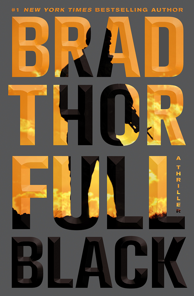
Alan Dingman is a fantastic portrait painter / illustrator and an Art Director/Designer at Simon & Schuster Pocket Books. We both worked together at St. Martin’s Press oh so many years ago and I recently hired him to illustrate FAME: What the Classics Tell Us About Our Cult of Celebrity for me. He called me asking if I could recommend anyone new who could design BIG BOOK COMMERCIAL THRILLERS. I immediately recommended my super talented colleague Ervin Serrano, who is the Associate Art Director at St. Martin's Press. But for some reason, probably my competitive nature, I asked if I could take a stab at it. Now I don’t do many BIG COMMERCIAL BOOK packaging but I told him that I wanted to do more and to give me a chance. I would try one quick go and if he didn’t like it, he could immediately hire someone else. Turns out that they were looking for a new approach to packaging their bestselling author Brad Thor so they were open to something different. What I thought I could offer this genre was a clean, and simple approach. I saw that the author and title were mostly short four letter words that would stack nicely. I had only one idea that I wanted to pursue, a dynamically angled typographic dominant approach.
My first round I tried the angled type set in Trade Gothic Bold Condensed and placed that over a foreboding Washington DC landscape with an ominous glow coming over the horizon. Hmm, that's not going to work. The type forms looked bad and the image was a bland cliché.
Alan sent me a link to a stock photo house that specialized in military type images and I changed the typeface to UNIVERS. Feedback: they thought the type was too playful but they liked the positive/negative interaction with type within the image:
I didn’t want to give up on the angled type. Maybe it was the typeface and not the angle treatment that they had problems with. Maybe the rounded curves of the UNIVERS “R” looked too friendly and the negative spaces were too open and generous and the widths uneven. I like that the “F” filled out the negative space better and the forms were more even. But it felt kinda bland.
Trade Gothic Condensed:
Univers Condensed:
Akzidenzs Grotesk:
Various Akzidenzs Grotesk Angled type configurations:
When I switched to AKZIDENZ GROTESK, I saw that this was more of what I was going for. Even sides, sharper corners and even type color overall. I tried comps using different angle configurations but they went with the type set straight forward, which in the end, I did have to agree with. Hey, I had to try the angle.
It was a challenge positioning the image and type to interact so that the figure's action made sense through the type and still have the type be legible. With each version I tried, I wanted to make sure that the word BLACK stayed mainly all black and create some calm space on the cover that wasn't so active. For something so simple, I presented over 60+ image & color combos, which isn't much considering that BIG BOOK projects can generate 100s and 100s of comps and the hiring of several designers. Big Books = Big Expectations.
The final silhouette had to be adjusted slightly to make it less militaristic and more Black Ops. Here's the final approved design before we Chisel Embossed it up:
I was so happy that the Publisher and author liked this approach off the bat which was a nice surprise. Using genre elements of big type, big author and a silhouetted figure against bright colored background but in a simple, clean and direct way. Good for an ongoing series look. And the book is currently on the New York Times Bestsellers List. Even though Brad Thor is no stranger to the Best Seller list, I like to think that my design had a small part in setting him up to new readers.
Brad AD sighting on the LIRR: (photograph by Patrice Kaplan)
Author Brad Thor on Piers Morgan Tonight / CNN with my jacket in the background:
CNN Video: Author Brad Thor on the Norway terror attacks:
Designer Paul Bacon is known for introducing the "Big Book Look" in book jacket design. His 1956 jacket design for Compulsion, a novel by Meyer Levin marked the inception of the "Big Book Look". This look features a large, bold title, a prominent author's name, and a small conceptual image:
A BFA graduate of the School of Visual Arts in NYC, he started his career in editorial design freelancing at Condé Nast, and Rolling Stone magazine with Art Director Fred Woodward. He got his first job in book publishing working as a Junior Designer for Louise Fili, the Art Director at Pantheon Books / Random House. He left to work for St. Martin's Press as a Senior Designer, eventually promoted to Senior Art Director Deluxe and to his current position as Creative Director of Picador, a leading literary trade paperback imprint launched in 1995.
He has won numerous awards including: AIGA's 50 Books/50 Covers, The Art Directors Club GOLD Cube Winner, The Type Directors Club, The New York Book Show, The Society of Illustrators, Print Magazine's Regional Design Annual, Communication Arts, Graphis magazine, and EYE magazine's JUST ADD STOCK Winner. His design and photography blogs were chosen as a HOW magazine Top Ten Site for Designers.
He is a frequent guest speaker, lecturer, and competition judge as well as an instructor at the School of Visual Arts, NYC.
He can always be seen with a camera in one hand and an Americano Café in the other.
First you start with a blank page, stare and think really hard, drink lots of coffee, take lots of breaks, fix the copier jam, update your Facebook page, get over the fears that this project is the one that will finally expose you as the hack that you are, and then just trust to do what you feel is right from what you've read, present your ideas to find out how they live outside of your head, listen to feedback, try to leave work at a decent hour, have a life, floss, get enough sleep, have a good breakfast and come back the next day to redo it all over again. It's that simple and fun. And if it isn't, then get another blank page and start all over again.




 Posts
Posts

