Tuesday, January 25, 2011

Charles Jessold, Considered as a Murderer


by Wesley Stace // A Picador Paperback Original

England, 1923. A gentleman critic named Leslie Shepherd tells the macabre story of a gifted young composer, Charles Jessold. On the eve of his revolutionary new opera’s premiere, Jessold murders his wife and her lover, and then commits suicide in a scenario that strangely echoes the plot of his opera---which Shepherd has helped to write. The opera will never be performed.

Shepherd first shares his police testimony, then recalls his relationship with Jessold in his role as critic, biographer, and friend. And with each retelling of the story, significant new details cast light on the identity of the real victim in Jessold’s tragedy.

This ambitiously intricate novel is set against a turbulent moment in music history, when atonal sounds first reverberated through the concert halls of Europe, just as the continent readied itself for war. What if Jessold’s opera was not only a betrayal of Shepherd, but of England as well?

Wesley Stace has crafted a dazzling story of counter-melodies and counter-narratives that will keep you guessing to the end.

A wonderfully layered novel with lot of plot pieces that could easily lead to a kitchen sink design approach. In order to rein it in, I needed to reduce it to its essential story elements:
1. Three intertwining main characters (Love Triangle)
2. Music (English specifically) and
3. Mystery (Historical)


I thought using an 8th Note Triplet musical note would be a nice symbol to suggest a story of three linked characters. And printing it on an aged distressed letter to say historical setting. But I needed to bring out the music aspect more so using sheet music came to mind.

I originally started with the classic Schirmer's Library Piano Sheet Music:

But I was informed that Schirmer's sheet music was not accurate for a novel about English music. A rival sheet music library, Edition Peters would be a better choice. The author's mother sent me several JPEGs of her music collection as reference.

A few had wonderful typographic solutions to possibly play off on:


But I went with this one because I had enough elements and wanted to keep my cover simple:


I didn't want to lift their look exactly so I found a similar frame in one of my favorite copyright-free Dover book of frames and borders, BORDERS, FRAMES AND DECORATIVE MOTIFS: from the 1862 Derriey Typographic Catalog by Charles Derriey:


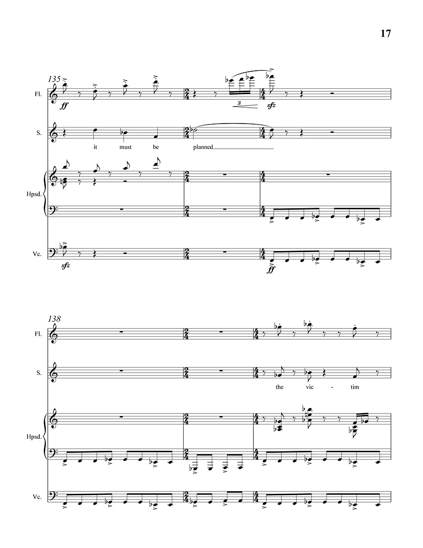
I overlaid the design on some burnt sheets of paper to give it a sense of distress and foul play. To give the faux cover some added depth, I used snippets of the music score composed expressly for this novel underneath. Bar 140 specifically because of the line "the victim." Although in the final design, the lyrics were covered up.

Opening title page of the score, "On Murder, Considered as a Fine Art: a suite for soprano with harpsichord, flute and cello" by Wesley Stace/Thomas De Quincey:

Bar 135-140:

Previous Directions
An Old Love Letter:

A Musical Score:

Damaged by Bullet Holes:


Final full Paperback Cover with French Flaps:


Eugene Mirman's hilarious interview with Wesley Stace for Picador Paperbacks:

Tuesday, December 21, 2010

My First Printed Cover Design: The High School Yearbook

Designer Extraordinaire John Gall has a post on his SPINE OUT blog of some of the cool Yearbook covers he found while doing research for his children's school "graphics" project.

This reminded me of when I was on my high school yearbook committee.
I was responsible for designing the Yearbook Cover and the section dividers. Other than the elaborate covers that I put more effort in than the one-paragraph long book reports I wrote, and for extra credit that I never received, or the mimeographed choir assembly programs created in my young artist career in grammar school, I think this is my first printed book cover. Complete with foil and deep emboss on a leatherette case. And Done on Spec. Pro Bono. Although I wasn't aware of a field called "Graphic Design". I just saw this all as illustration.
I was in the class of '83. Not as interesting as the ominous "1984" just coming over the horizon. The committee came up with our big thought-provoking theme. REFLECTIONS. The unknown future gave us lots to think about. But not enough for a concept. Think "Reflections." Hmmm. a-HA! Mirrors! You know. Because they reflect. Brilliant! Jacket meetings were so much easier back then.

My high school yearbook:

It's funny to see so many graphic elements present themselves here so early on that still show up in my work now.
Block lettering. Type in Perspective, Frames. And nostalgia brown.
Ugh. I. am. such. A hack.

I read somewhere that all artist have three ideas that truly interest them in life. And everything they create is a variation and exploration of those three ideas. Hmm, something to reflect upon.


My Grammar school Choir program Design:

Check out the calligraphy, stacked type, alternating colors and curved musical staff. I'm just brimming with brilliant ideas.

And here's an interview with Gall In His Own Words:

Tuesday, October 05, 2010

FAME: What the Classics Tell Us About Our Cult of Celebrity


by Tom Payne // Picador

Cover illustration by Alan Dingman

In this erudite, acidly funny book, Tom Payne discovers in the constellation of our celebrity culture distinct parallels between the immortals of Homer, Aeschylus, and Euripides, and the glittery personalities in your copy of People magazine.

We may treat celebrities like deities, but that doesn’t mean we worship them with deference. Is it possible that humanity, from pre-history to the present, has possessed a primal urge to first exalt the famous, and to then sacrifice them? Are there similarities between the rise and fall of Michael Jackson and the ancient Greek practice of Ostracism, between Tiger Woods and Achilles, Farrah Fawcett and St. Felicity, Heath Ledger and Dr. Faustus? From Greek mythology to the stories of Christian martyrs, Payne makes the fascinating argument that our relationship to celebrity is perilous, and that we wouldn’t have it any other way.

In this brilliant book, Payne brings new life to the past and all of the characters from your high school literature class. Here the most ephemeral reality television stars (the “famous for being famous”) occupy the same VIP lounge as the characters of The Iliad, and Payne shows that the people we choose as our heroes and villains throughout the ages says much about ourselves.

A dazzling and often hilarious look at the mortals, and the immortals—us and them.


To show that the obsession with the "famous" is not a new thing. My initial idea was to bridge a fame-obsessed society and their adoration of classical gods with a modern take of the goddess Athena dogged or posing for ancient camera-wielding paparazzo:

Alan's sketch:


Two Papa-paparazzi layout approaches:


Funny, but it was probably too anachronistic.


This cover of Edith Hamilton's MYTHOLOGY is one of my favorite because of the beautiful spot illustration of Pegasus and Bellerophon/Perseus starkly silhouetted against black.


The layout on this edition is not as interesting but the art is better represented here:


It inspired this simpler direction with Athena on a stylized Hollywood Walk of Fame:

Alan's SKETCHES:


The simplicity of this idea won out but with Athena illustrated and placed over the orange pottery background.

Hamilton's cover was also in the back of my mind when I designed this rejected cover for Jeffrey Eugenides' MIDDLESEX.


Photo-illustration by Marc Yankus

PEGASUS PWNS UNICORNS!

Wednesday, August 18, 2010

The Flooded Earth


by Peter D. Ward

Art Director: Nicole Caputo // Basic Books

Renowned paleontologist Peter Ward tells why the effects of sea-level rise from global warming will be more profound than you think—and how humanity will adapt.

Sea level rise will happen no matter what we do. Even if we stopped all carbon dioxide emissions today, the seas would rise one meter by 2050 and three meters by 2100. This--not drought, species extinction, or excessive heat waves--will be the most catastrophic effect of global warming. And it won't simply redraw our coastlines--agriculture, electrical and fiber optic systems, and shipping will be changed forever. As icebound regions melt, new sources of oil, gas, minerals, and arable land will be revealed, as will fierce geopolitical battles over who owns the rights to them.
In "The Flooded Earth," species extinction expert Peter Ward describes in intricate detail what our world will look like in 2050, 2100, 2300, and beyond--a blueprint for a foreseeable future. Ward also explains what politicians and policymakers around the world should be doing now to head off the worst consequences of an inevitable transformation.


I originally designed this with just the Manhattan skyline under water but I was asked to adapt the concept to put across that this is a Global event. So I included San Francisco's Transamerica building and Paris' Eiffel Tower. I like it, although the final kinda looks like Las Vegas is under water.

Various comps:


As you can see, the shocking twist ending written by Rod Serling for the Planet of the Apes left a big impression on me growing up:

Thursday, April 22, 2010

Choice: BIG IDEAS // small books


by Renata Salecl
BIG IDEAS // small books / A Picador Paperback Original

Photographs by Jon Shireman
The essential idea is that choice, which we’d always thought of as the great prize of free markets and free societies, can become a paralyzing burden when there’s too much of it. Renata Salecl argues that in the developed world we’re told that we can choose everything about who we are, how we live, what we buy, how we look, down to the last detail. But that’s too much choice; we lose our sense of who we are and we don’t know how to make those choices, so we end up choosing them based on other people’s expectations or other outside forces—so in the end there’s nothing very personal about all this personal choice

To illustrate the concept of quantity of choices over quality of choices, I thought of playing off the pun "A needle in a haystack" with finding a needle in a needle stack. Overwhelmed by too many meaningless same choices.
Another approach was the idea of having to choose between two glasses that are either equally half full or half empty. Because in the end, it really doesn't matter which glass you agonize over and eventually choose, they're really both the same and you get out of it what you make of it. Jon did a fantastic job visualizing these ideas.


It doesn't happen too often that I love both solutions equally. But unfortunately we at Picador, for whatever reasons, chose not to publish this title for our BIG IDEAS // small books series. So I'll never have to make a choice and I get to choose both. But if this was published, the editor picked the two glasses. Both half full of course.

Wednesday, March 10, 2010

Hotel Iris


by Yoko Ogawa // A Picador Paperback Original

• An AIGA's 50 Books // 50 Covers Best Cover 2010 Selection

A tale of twisted love, from the author of The Diving Pool and The Housekeeper and the Professor

In a crumbling seaside hotel on the coast of Japan, quiet seventeen-year-old Mari works the front desk as her mother tends to the off-season customers. When one night they are forced to expel a middle-aged man and a prostitute from their room, Mari finds herself drawn to the man's voice, in what will become the first gesture of a single long seduction. In spite of her provincial surroundings, and her cool but controlling mother, Mari is a sophisticated observer of human desire, and she sees in this man something she has long been looking for.

The man is a proud if threadbare translator living on an island off the coast. A widower, there are whispers around town that he may have murdered his wife. Mari begins to visit him on his island, and he soon initiates her into a dark realm of both pain and pleasure, a place in which she finds herself more at ease even than the translator. As Mari's mother begins to close in on the affair, Mari's sense of what is suitable and what is desirable are recklessly engaged.

Hotel Iris is a stirring novel about the sometimes violent ways in which we express intimacy and about the untranslatable essence of love.

A creepier book than her other titles. We wanted it to have a dark, David Lynch tone to it. Off-centered and living in the shadows. The author's two previous novels had a dominant blue palette so I wanted to carry that through. Good thing the title had the word "IRIS" in it. I shifted the color balance to an overall violet tone and enclosed the scene in darkness on the edges to form a circular iris like a fade to black. The ferryboat came from a photo I took from my trip to Block Island, RI.


An earlier approach that wasn't menacing enough:

Wednesday, March 03, 2010

American Photo Magazine: A Collaboration with Marc Yankus & Phil Pascuzzo

An article discussing my collaboration with photographer Marc Yankus and illustrator Philip Pascuzzo on the cover design of Burnt Shadows appeared in the March/April 2010 issue of American Photo magazine.

FOCUS | SIDE BY SIDE - Cover Story: A photographer and art director capture the essence of a book in a single image.

Burnt Shadows by Kamila Shamsie


Wednesday, February 17, 2010

Venus Drive


by Sam Lipsyte / Picador

An intense, mordantly funny collection of short fiction from the author of Home Land and The Ask.

A man with an "old soul" finds himself at a Times Square peep show, looking for more than just a little action. A young man goes into some serious regression after finding his deceased mother’s stash of morphine. A group of summer-camp sadists return to the scene of the crime. Sam Lipsyte’s brutally funny narratives tread morally ambiguous terrain, where desperate characters stumble over hope, or sometimes merely stumble. Written with ferocious wit and surprising empathy, Venus Drive is a potent collection of stories from "a wickedly gifted writer" (Robert Stone).

The Picador paperback edition includes an excerpt from The Ask.

Monday, February 01, 2010

The Autobiography of an Execution


by David R. Dow

Art Director: Anne Twomey // Twelve Books - Grand Central Publishing

Cover photograph by Henry Sene Yee Photography

As a lawyer, David R. Dow has represented over 100 death row cases. Many of his clients have died. Most were guilty. Some might have been innocent. The Autobiography of an Execution is his deeply personal story about justice, death penalty, and a lawyer’s life.

It is a chronicle of a life lived at paradoxical extremes: Witnessing executions and then coming home to the loving embrace of his wife and young son, who inquire about his day. Waging moral battles on behalf of people who have committed abhorrent crimes. Fighting for life in America’s death penalty capital, within a criminal justice system full of indifferent and ineffectual judges. Racing against time on behalf of clients who have no more time.


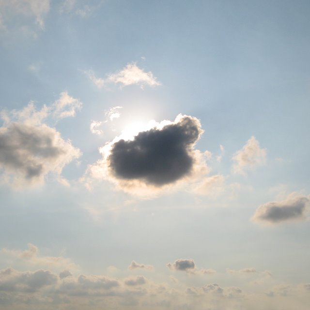
Ain't no sunshine when they're gone.

Initial concept sketches:


Behind the Book:


The photo came from a series I shot called:

SUN ON.


SUN OFF.


These photographs and a few more of mine appear in The Graphic Eye: Photographs by Graphic Designers from around the Globe by Stefan G. Bucher


Bottom photograph by Karen Horton. As seen being sold at Urban Outfitters